A Tale of Four Graphs
When you go back to look at the pace graph on a running log, it should answer some questions for you:
- What type of run did I do that day?
- How fast and far did I go?
- If I did an interval workout of any sort, how long were the intervals and how fast were they?
- Where was I when I was running this pace? Was it on a hill or flat?
The Data
When we try to review and analyze GPS data, it's important to keep in mind that it's noisy. The GPS signal can be off by small or large increments, the signal can be blocked by large buildings or trees, and the watch can temporarily lose connection or record incorrectly due to a software bug.
Furthermore, any person's running pace is not completely steady. When you run what feels like an even pace for a time, there are always variations up and down.
A pace graph should help us see through the noise in the data to gather the information we want.
If I ran a kilometer at some pace, I'd like to know if I started fast and became slower at the end, or vice versa; this can be difficult to see if the graph paints an extremely jagged picture.
Strava and Garmin Connect
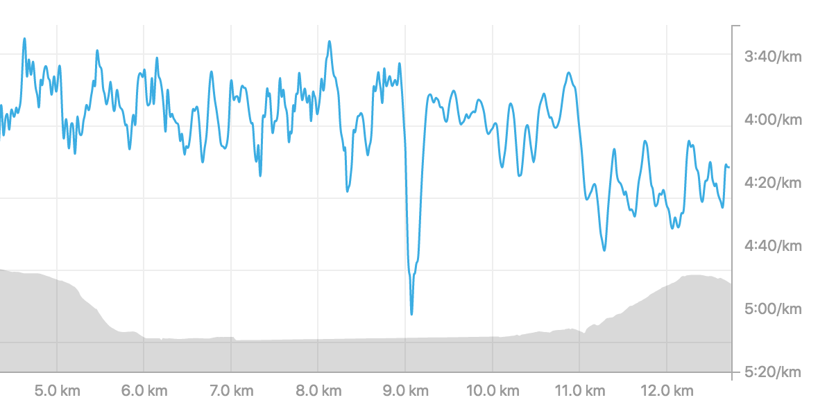
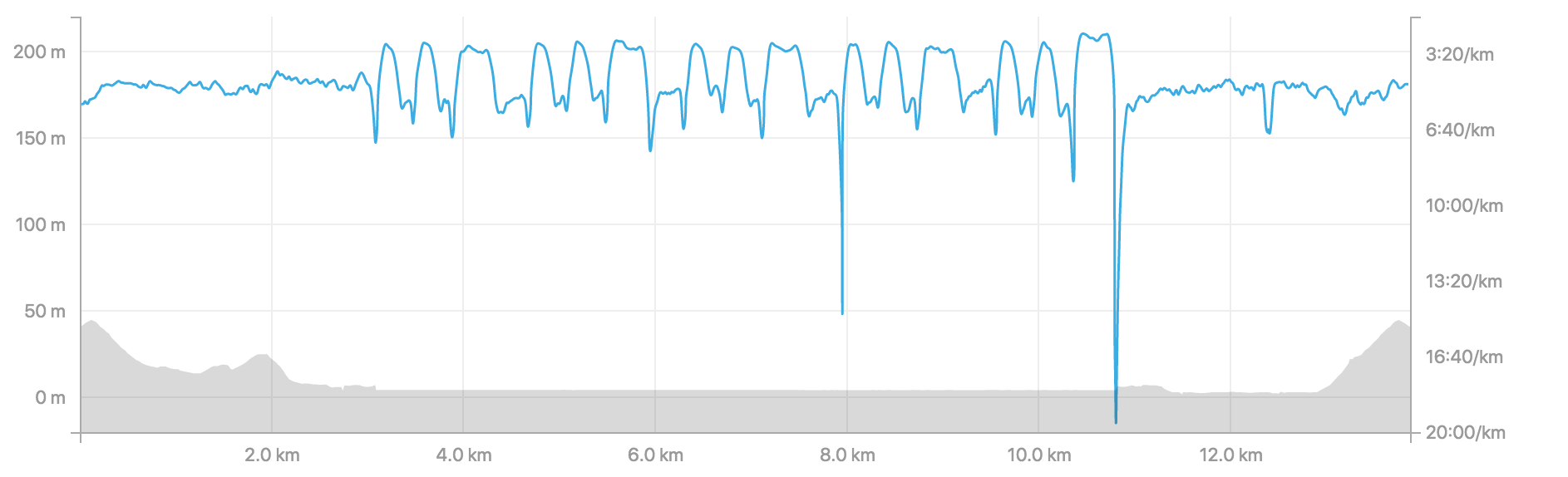
Strava's default pace graph shows too much of this noise. For example try to guess what pace I was running between 5km and 8km:
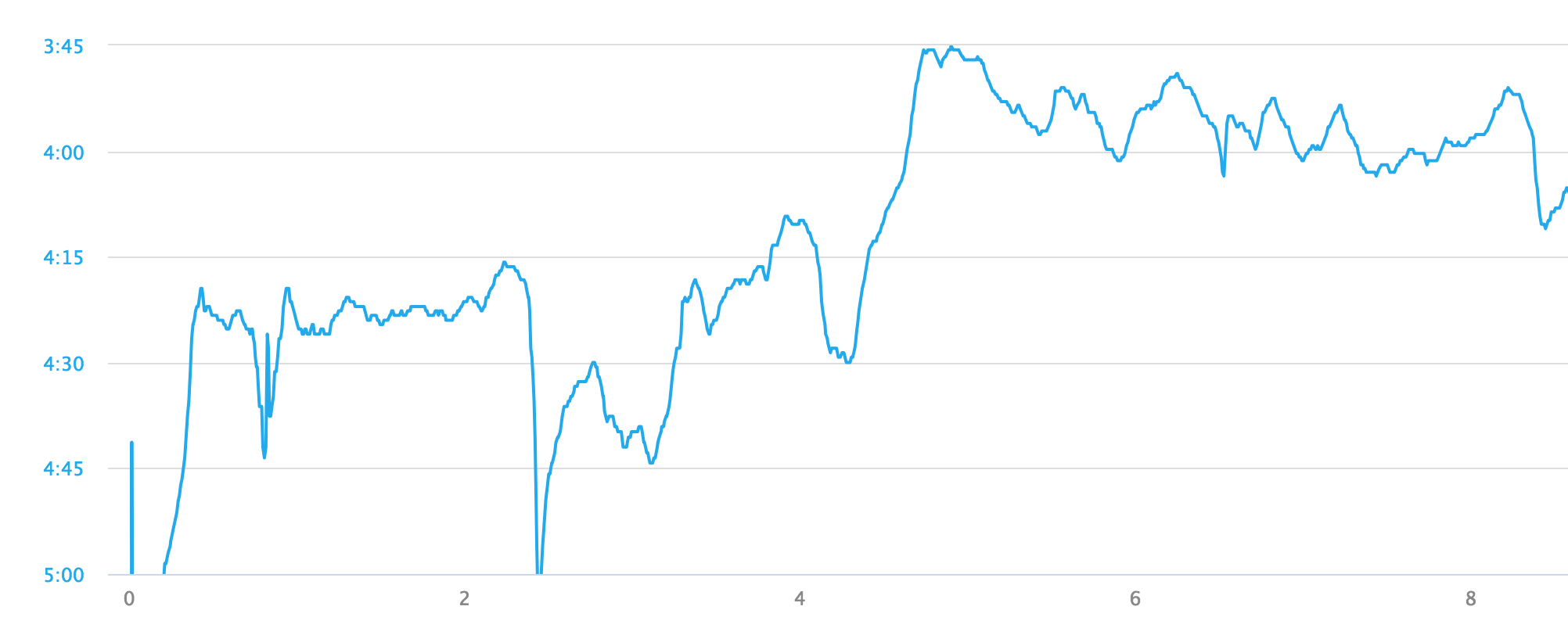
Garmin Connect's graph is smoothed a bit, and it's much clearer that between 5km and 8km I was running just a bit faster than 4:00/km:
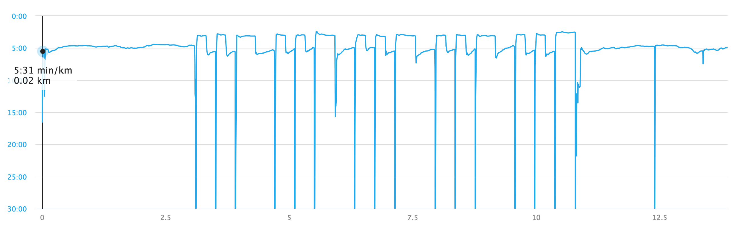
Strava offers an even smoother line as part of its "workout analysis":
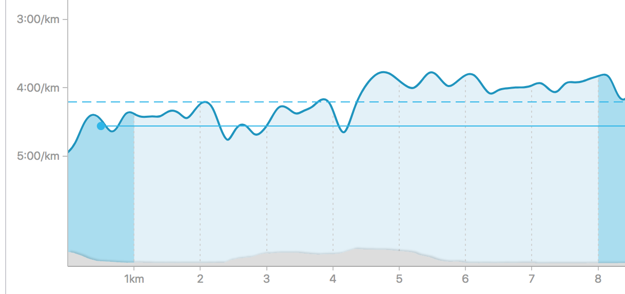
There is greatly reduced noise on this graph, but the lack of grid lines makes it hard to tell exactly where the line is.
The answer, by the way, is that I ran an average pace of 3:58/km for those three kilometers.
Smashrun
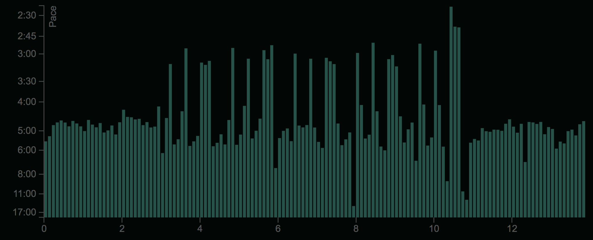
Smashrun, a competitor to Garmin Connect and Strava, does not offer a line graph to show you the pace of your run; instead they've chosen to show you a bar graph where every bar represents your average pace over 1/10 of a kilometer:
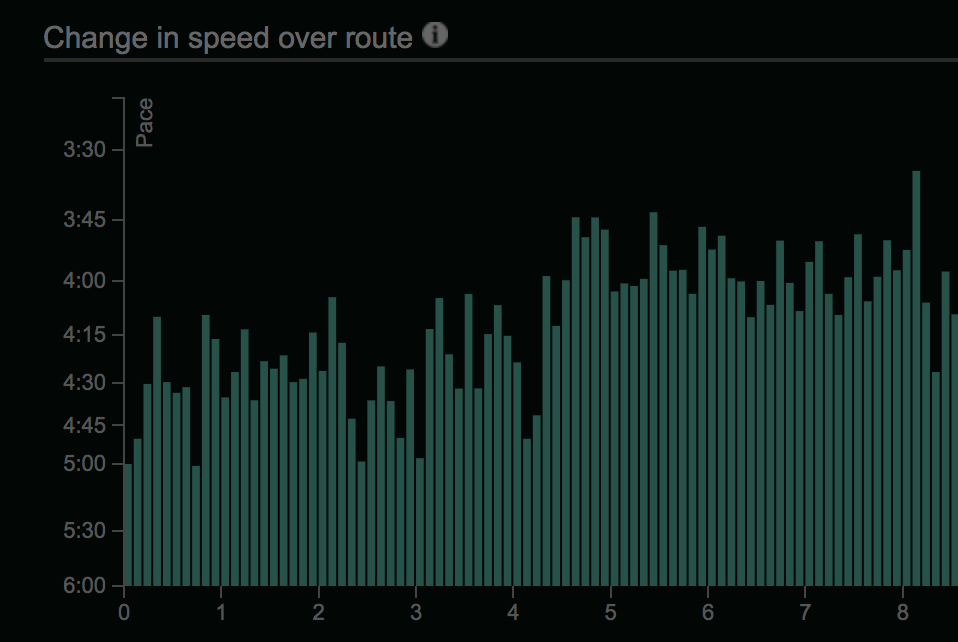
This is easily the worst of the four graphs we've seen so far. The lack of gridlines makes it extremely difficult to tell at a glance what pace a bar represents, and the choice to split paces at an arbitrary limit of 100m compounds the difficulty.
The choice to split the paces into bins of seemingly random size also leads to artifacts: what is with the big spike at (or just after? It's very hard to tell) km 8?
The bins are not labelled and there is no legend, so I had to count the bins to see how many there were.
If I switch the site from kilometers to miles, the bins increase in size to 1/10 of a mile, and magically the big spike around kilometer 8/mile 5 disappears! It was an artifact of the bin size that had been chosen, and not an actual spike in pace.
The bins also fail dramatically if we look at a workout with short intervals. Here's Strava, Garmin, and Smashrun showing a workout where I did 5 sets of 200 meter, 200 meter, 400 meter sprints:
This time Strava is the clear winner. Its graph makes my paces extremely clear and the intervals are clearly outlined.
The Garmin graph is good, except for the artifacts at the beginning of each interval. These are even more confusing because my watch is a Garmin watch, so they control the entire data chain.
Garmin's line graph more closely approximates my interval efforts, demonstrating that I ran a fairly consistent pace during the interval. Strava clearly has some smoothing going on, because my 200 meter runs look like they have peaks instead of being a consistent effort.
Smashrun's graph is totally unreadable; given only that graph you would not have any idea what sort of run I did that day. This ought to be a primary use for the pace graph; when I go back and look at my history, I want to know if I ran intervals on a given day and if so, how fast they were.
The bar chart also gives a hugely heavy visual weight to the bottom half of the graph, which does not have any useful information! All the reader of the graph wants to know is where the tops of the bars are; this suggests right away that it should become a line graph.
I like Smashrun, but their pace bar chart is misleading and often useless. They should change it to a line graph. Neither Garmin's nor Strava's pace charts are perfect, but they're both far better.